Sharendipity
Summary
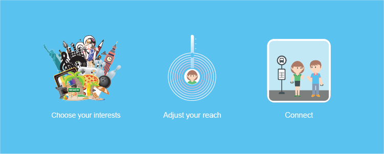
Sharendipity connects people who want to meet new people with shared interests - in real life. As users go about their daily activities, Sharendipity scans around their physical environment for people who would make fantastic conversation buddies, sports teammates, friends, etc. When Sharendipity finds someone and both parties agree to connect, Sharendipity helps them locate each other.
Design Process
- Interviews
- Sketching
- Low Fidelity Prototype
- Cognitive Walkthrough
- High Fidelity Prototype
- Usability Evaluation with 4 experts
Interviews
Led by me, my team conducted interviews with regular people to find out how receptive they would be to connecting to people around them and how they would like the interaction to happen. We learned that people would like:
- The interaction to be serendipitous and ephemeral
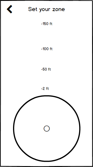
- To modulate the physical distance from them with which the service would connect them to other people
- To specify the criteria with which they are matched to others
Sketching
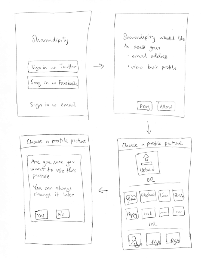
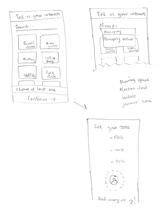
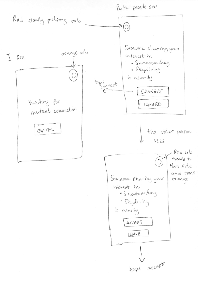
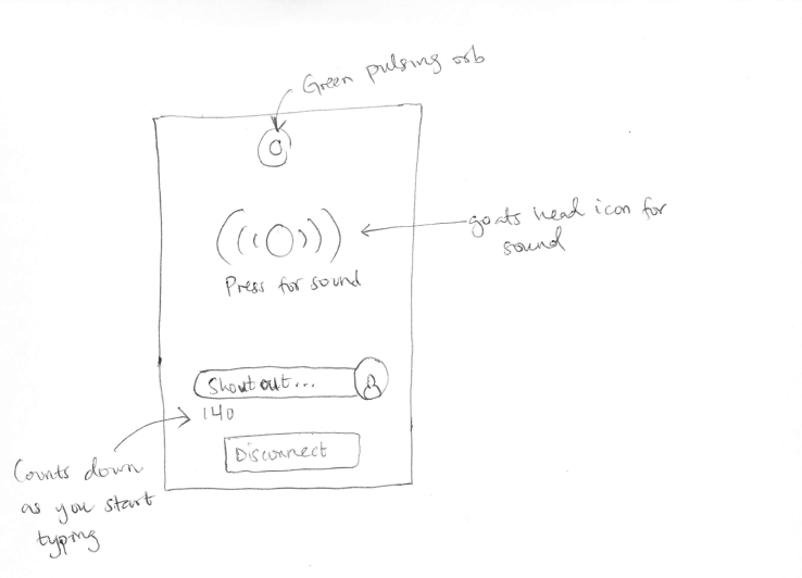
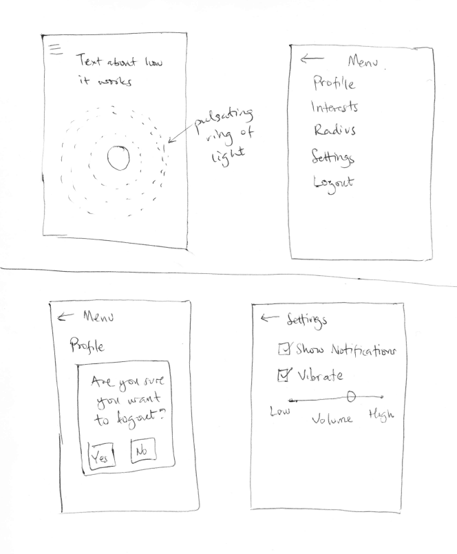
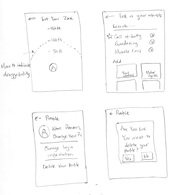
We created quick sketches to capture, and communicate within the team, a potential solution that walked users through setting up the mobile app, connecting with people, and modifying their preferences.
Setup
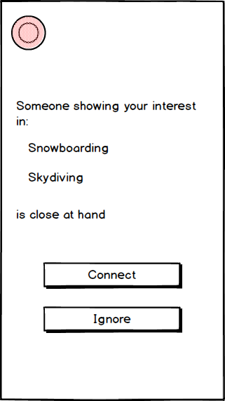
Connecting after getting a notification
Managing Preferences
Low Fidelity Prototype
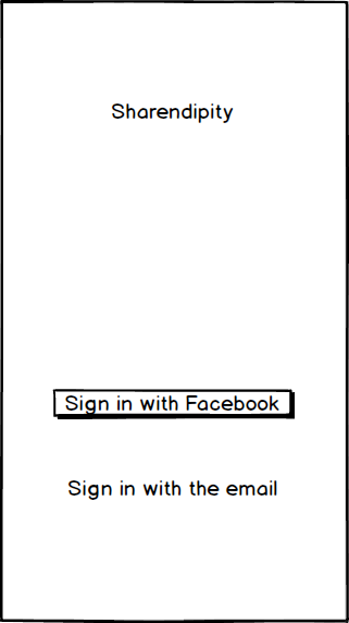
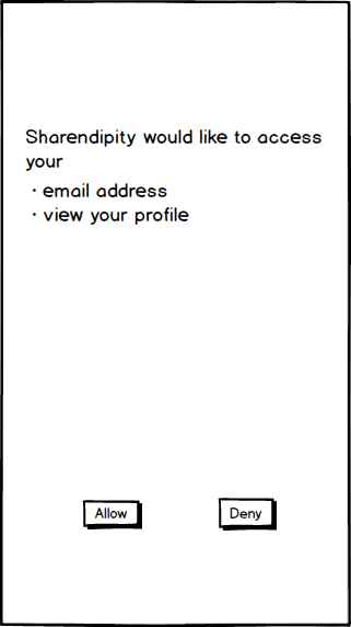
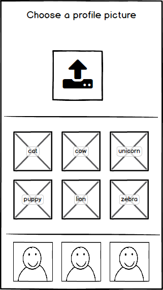
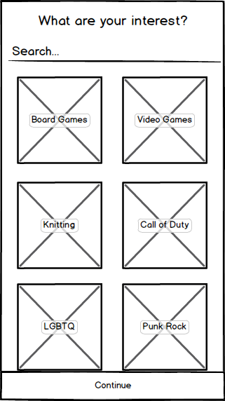
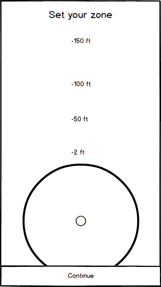
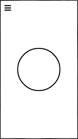
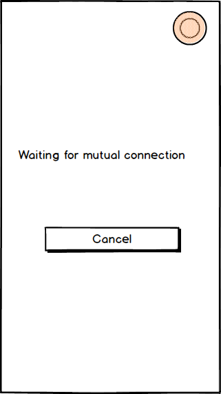
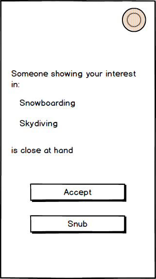
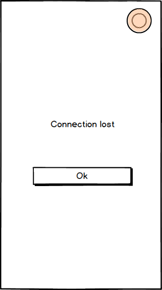
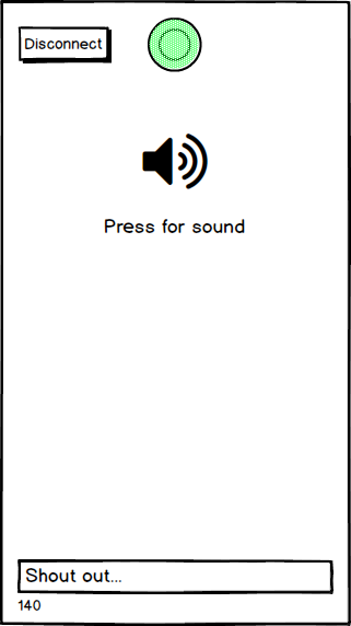
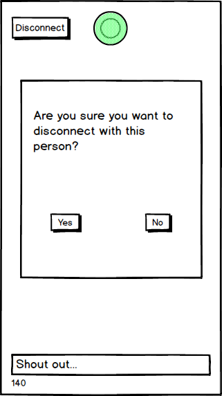
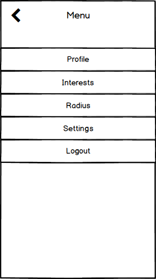
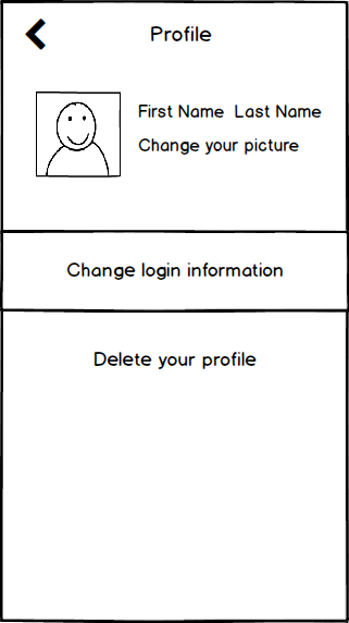
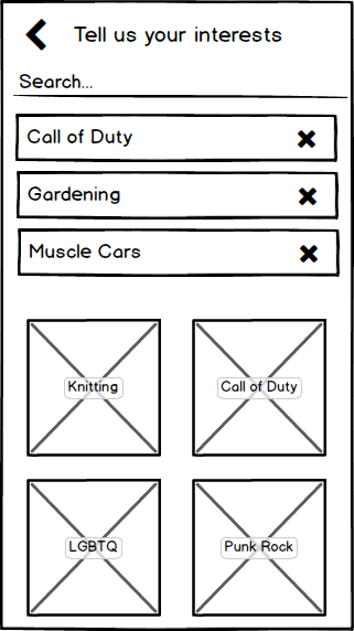
Using Balsamiq, we created low fidelity mockups and a paper prototype to quickly assess the usability and feasibility of our concept for Sharendipity
Setup
Connecting
Managing Preferences


Cognitive Walkthroughs
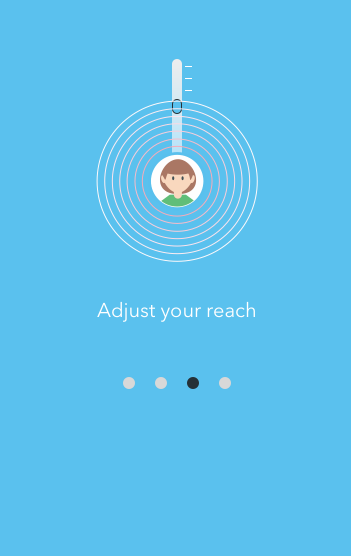
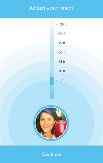
Conducting cognitive walkthroughs on our paper prototype of Sharendipity allowed us to quickly and cheaply test its usability. We realized that:- "Adjust Your Reach" would better communicate the idea of connecting to people as opposed to "Set Your Zone"
- While helpful in indicating the status of a connection, the red, orange, and green pulsating orbs could be distracting
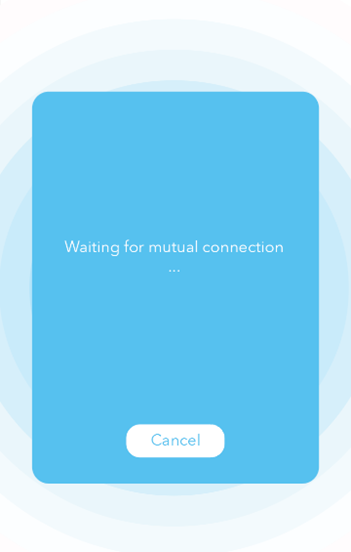
- When Sharendipity is waiting for the other person to agree to connect, we needed a way to reassure the user that it is not hung up
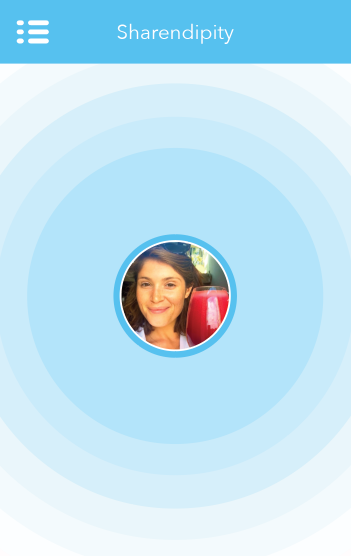
- Putting the user's profile picture at the center of the circle when Sharendipity is scanning the environment would better indicate what it is doing
High Fidelity Prototype
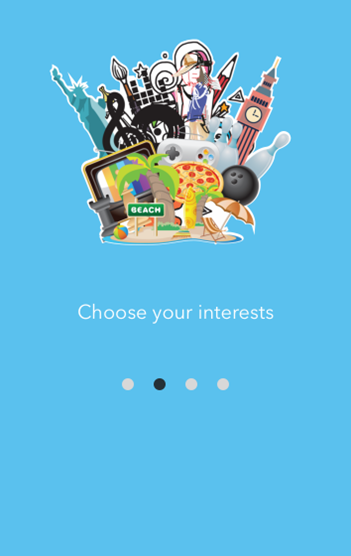
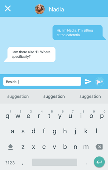
We built high fidelity mockups using Adobe Illustrator and Sketch. And made interactive prototypes out of the mockups using Invision. Interactive Prototypes: Sign up and Menu Prototype and Notification and Chat Screens
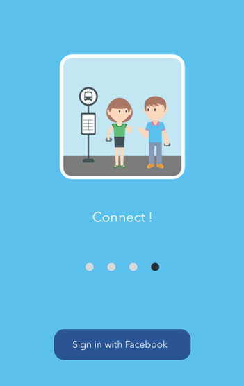
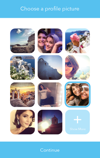
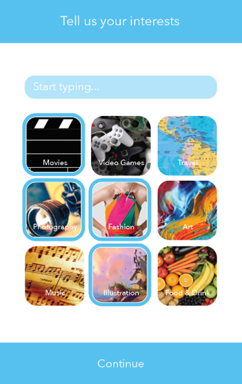
Setup/Onboarding

Connecting
Expert Usability Evaluations
Since Sharendipity can be used by anyone, we sought to find out what users thought of it as well as its usability. To accomplish this, we recruited 4 UX professionals to evaluate it. The evaluators used the interactive prototypes to perform representative actions after which they completed a post task questionnaire and relayed their thoughts. The questionnaire was a seven point, ten aspect semantic differential designed to gauge their emotional and attitudinal responses to Sharendipity.
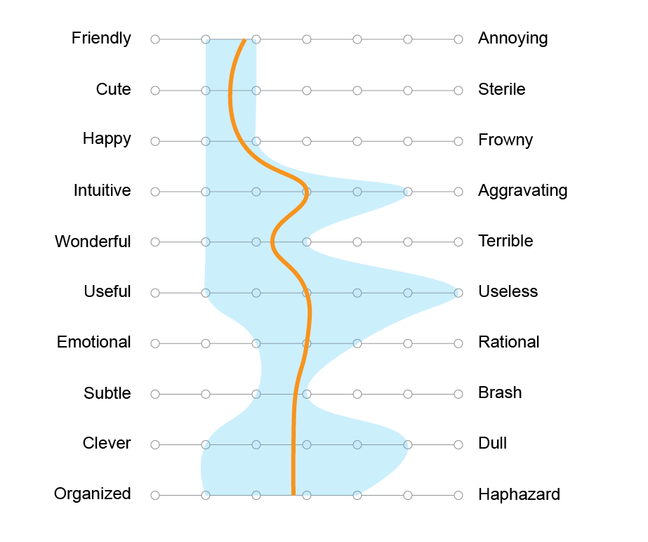
The orange line represents the average response while the light blue region represents the range of responses. Sharendipity elicits overall positive emotions as attested to by the semantic differential.
The Good
"The design is clean and attractive and I like the name Sharendipity. It's clever"
"First I want to say it's a pretty cool idea"
"LOVE the adjust your reach option"
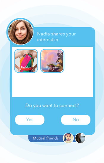
"LOVE the 'Do you want to connect' screen. Shows the profile of the person plus the common interests. Clean and simple. I also think showing mutual friends is a fantastic idea. This can give the user a comfort level in the connection. It also reinforces the consent for both parties."
Could Be Improved
- Ask users for permission to use location and context data
- Use a list checkboxes or switches to indicate all the available notifications as well as their present and potential states
- Improve the onboarding by explaining what the "Reach" is with something like "Reach is how far away we will look"
- Improve the onboarding by allowing users to act on information they have just received
- Add a way to "Discover" people around who may not share interests, but are Sharendipity users
Check out some of my other projects

MINDSpeed
Building a system to easily order healthy food and get rewards
Open Journals
Discovering what's important and reimagining a better experience for academic journal editors

IUSOC VMS
Improving and easing the process of signing up volunteers

The Car Wizard
Making the online car shopping process a breeze, one answered question at a time
Back to Projects To Top