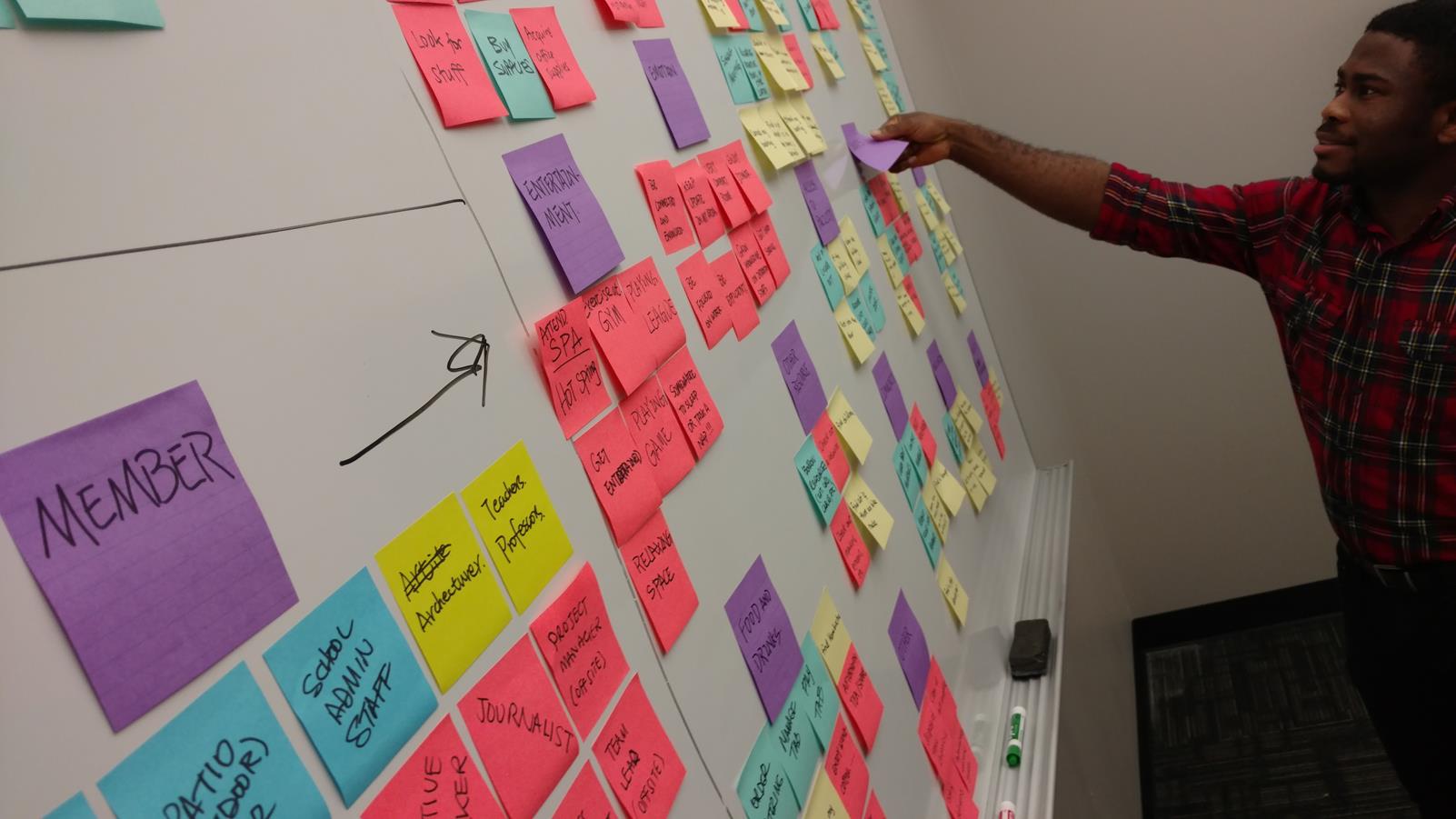
Affinity Diagramming
Affinity Diagramming is a process of clustering individual observations from research around common themes. These themes reveal themselves as the design team pores over the collected data.
Affinity Diagramming is Day 3 of 100 Days of UX, an exploratory effort to survey the 100 methods of design outlined in Martin and Hannington's Universal Methods of Design. For 100 consecutive days, I learn one new method a day and write about it.

Affinity Diagramming is usually done with post it notes, but it can also be done using online collaboration software.
Affinity Diagramming helps the design team to get the knowledge buried in their head and in transcripts out into a very visual medium that everyone can play with, gain insights from, and generate ideas.
It can be used to analyze data from contextual inquiries, usability tests, and a variety of other sources. In short, it is the method for discovering "affinities" between many data points.
Affinity Diagramming is one of the most popular and versatile UX methods, and over the years, many people have devised different ways to apply it to their design problems. As such, there are so many quality resources to learn from.
References
- Martin, B., & Hanington, B. (2012). Universal Methods of Design: 100 ways to research complex problems, develop innovative ideas & Design effective solutions. Rockport
Day 2 - AEIOU 100 Methods Day 4 - Artifact Analysis